Color Wheel
Color theory is the study of how colors work together and how they affect our emotions and perceptions. It's like a toolbox for artists, designers, and creators to help them choose the right colors for their projects. Color theory enables you to pick colors that go well together and convey the right mood or message in your work.
History of Color Wheel:
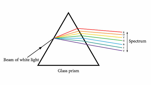
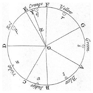
Sir Isaac Newton developed the first color wheel when he expanded the theory in his 1704 work, Opticks. With the color wheel, Newton said that the source of color was light and that white light, when passed through a prism, created a spectrum of colors ranging from red to violet. He viewed color as a closed system or wheel that contained the colors red, orange, yellow, green, blue, indigo, and violet.
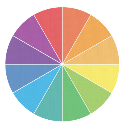
The color wheel contains the twelve colors that are visible to the human eye:
- Red
- Red-Orange
- Orange
- Yellow-Orange
- Yellow
- Yellow-Green
- Green
- Blue-Green
- Blue
- Blue-Violet
- Violet
- Red-Violet
Color Terms
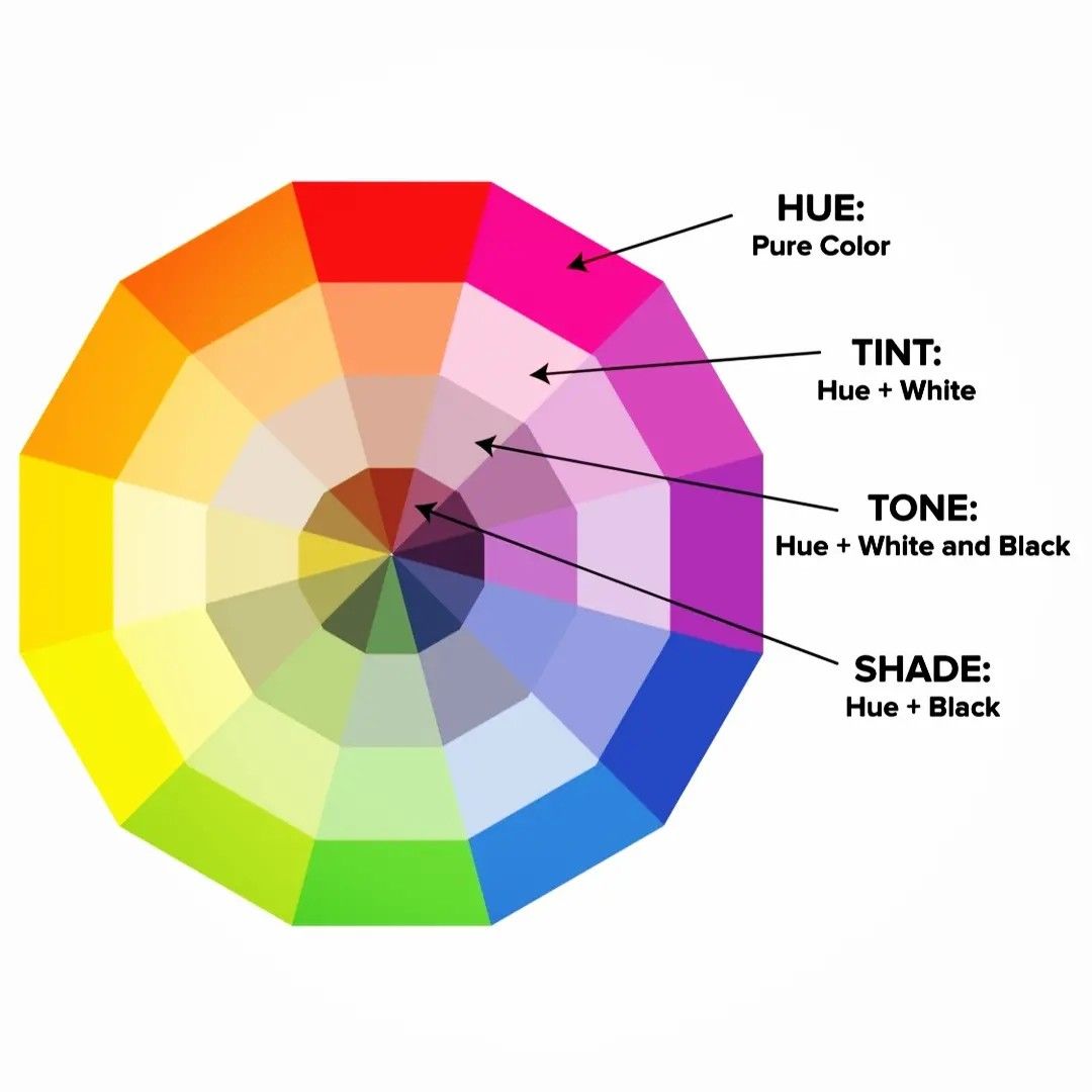
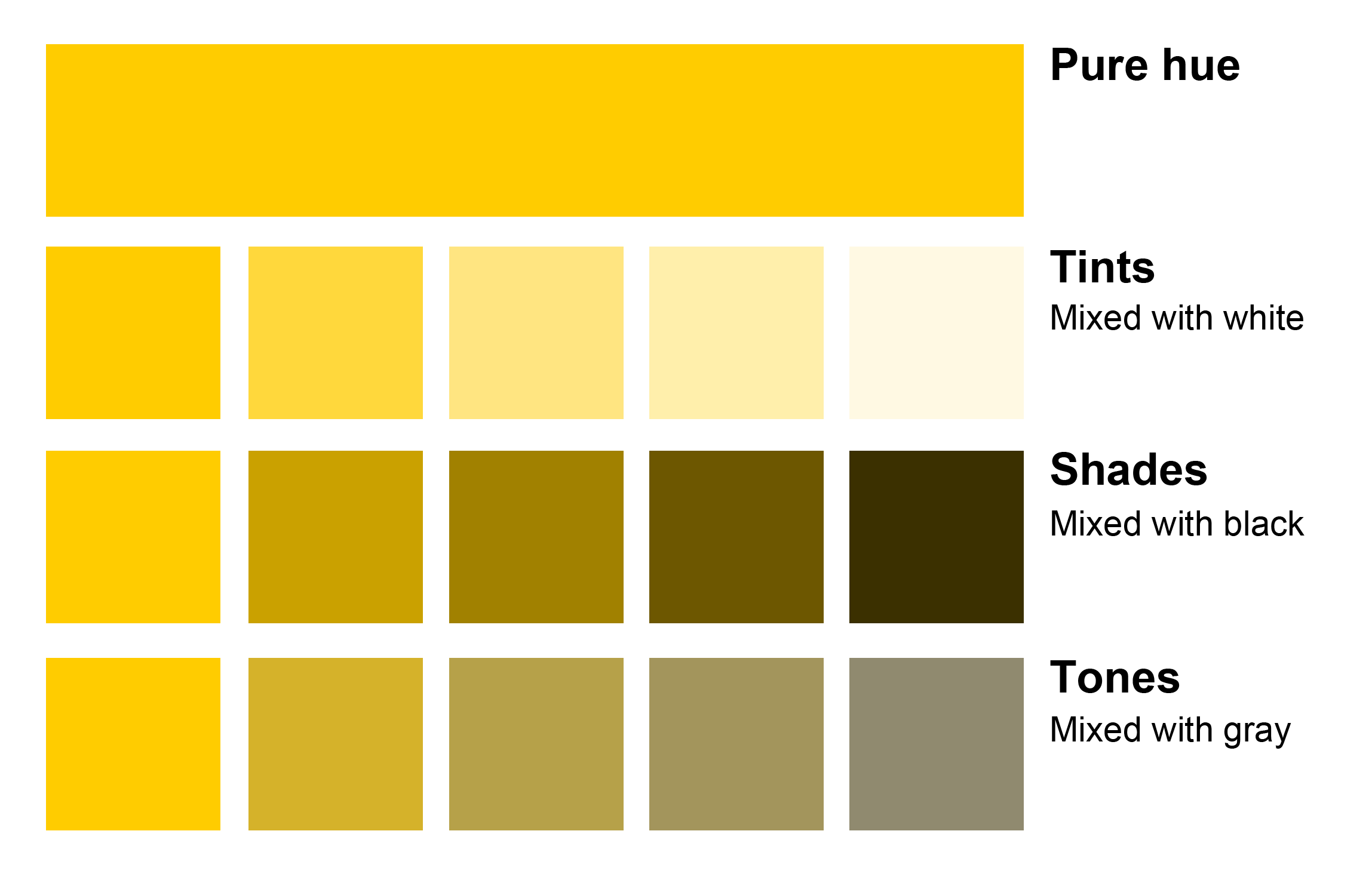
The four main qualities of each color are Hue, tint, tone and shade.
Hue (another name for color) is the color in its purest form. You would refer to red as a hue.
Tint - is a mixture of a color with white, which increases lightness.
Tone - is the color that appears on the surface.
Shade - is a mixture of color with black, which increases darkness.
Neutral colors are muted or softened colors. Examples of neutral colors include gray, brown, black, and white. Neutral colors look nice with primary and secondary colors.
Value
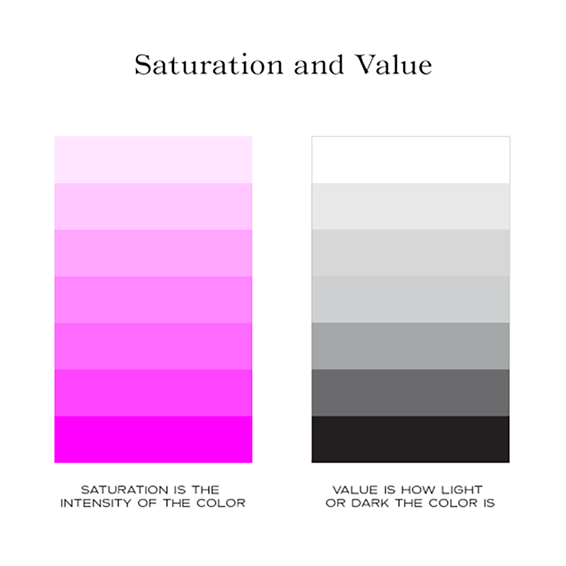
The value of the color is altered when the neutral colors of black or white are added to it. It is essentially the darkness or lightness of a color. Tints are the result of adding white to the pure hue. Shades are the result of adding black to the pure hue.
Saturation
The Saturation refers to the intensity or strength of the color. A color in its purest form, without any neutral colors added, is considered fully saturated. Any additions of neutral colors change the intensity of the color, desaturating it. Think “vivid” vs. “dull”.
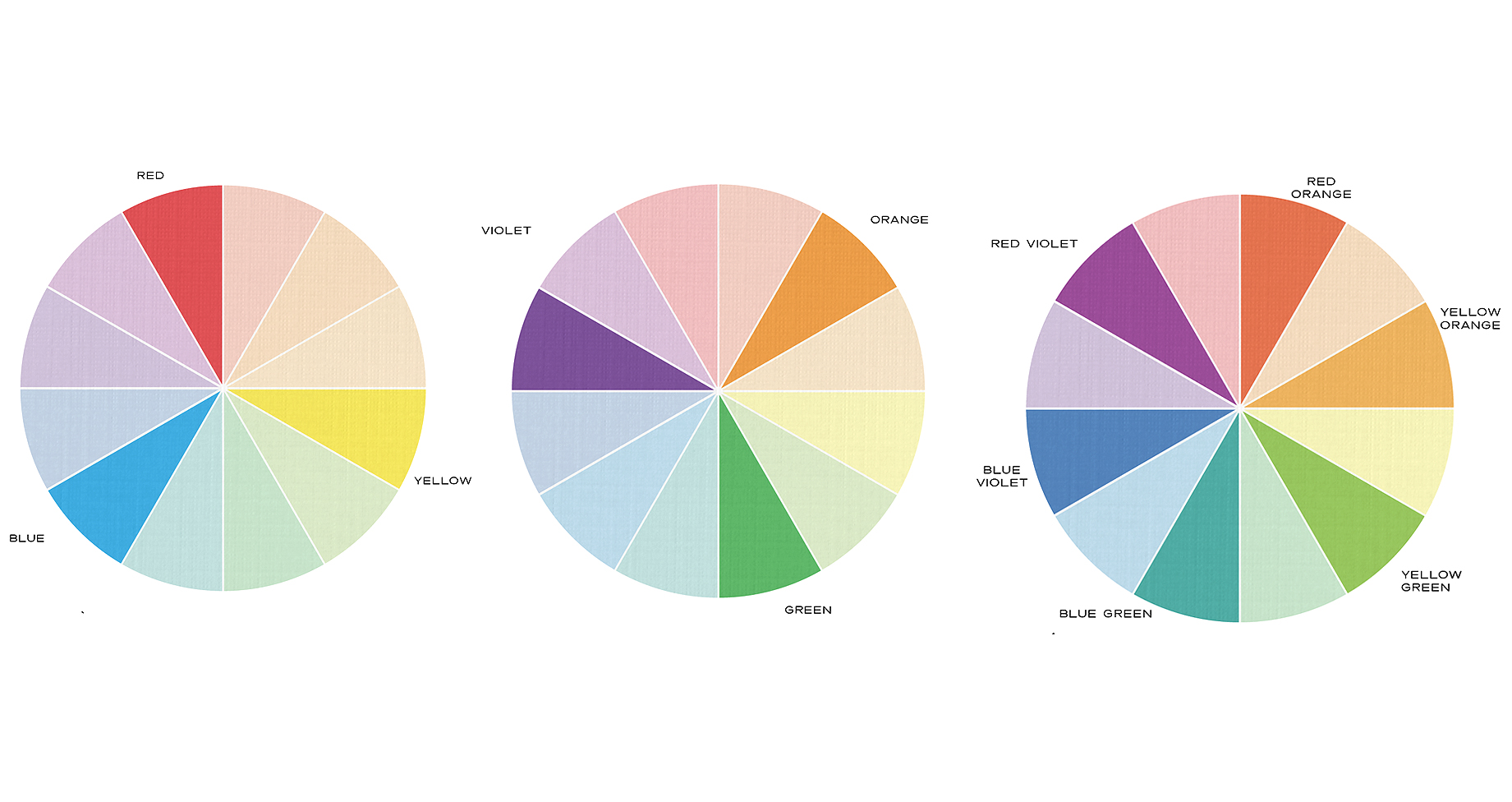
The Primary Colors are Red, Yellow, Blue. These three colors are mixed together to all of the other colors.
The Secondary Colors are Orange, Green, Violet. These colors are created by mixing the primary colors together as shown.
The Six Tertiary Colors are Red-Orange, Yellow-Orange, Yellow-Green, Blue-Green, Blue-Violet, Red-Violet, which are formed by mixing a primary with a secondary.
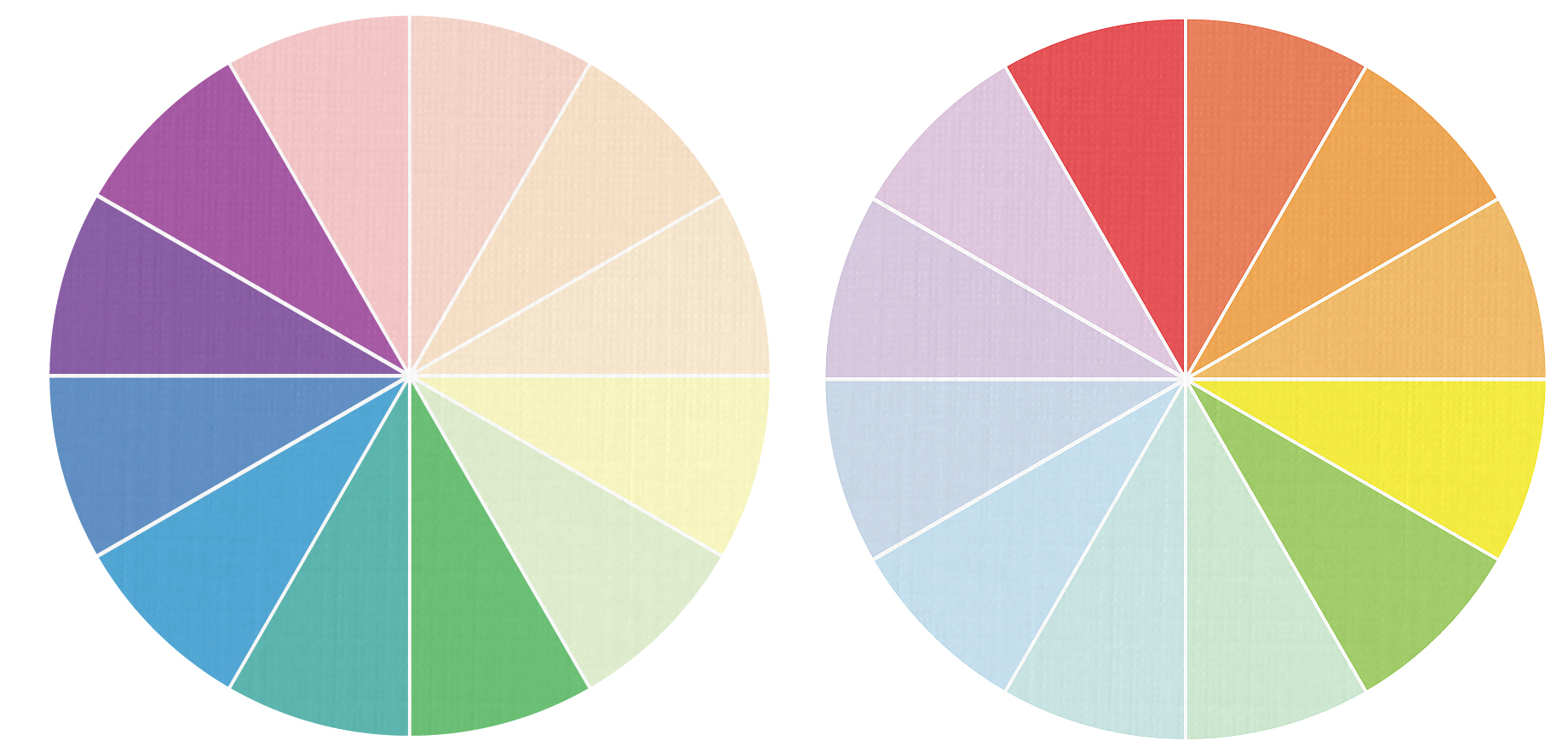
Temperature - warm vs cool colors.
Warm colors (red, yellow and orange) can create feelings of comfort, energy, excitement or even hostility.
Cool colors (blue, green, purple) can create feelings of calmness, restfulness or even depression.
Complementary
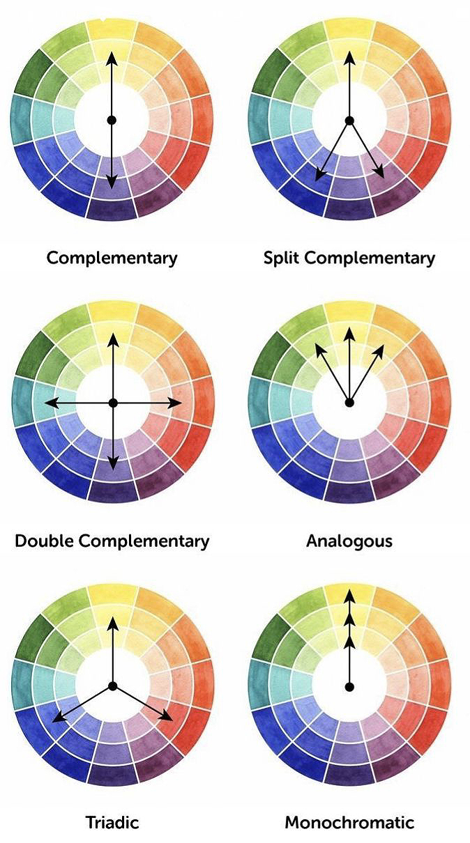
Complementary color schemes are made up of two colors that are directly across from each other on the color wheel. Complementary schemes provide high contrast and are often used for sports teams and logos.
Analogous
Analogous color schemes are made of 3-5 colors that are next to each other on the color wheel. Analogous schemes provide harmonious color relationships with little contrast.
Palette - group of colors used to describe a mood or theme.
Color Schemes
Color schemes are created by the relationships of colors based on their locations on the color wheel. While any combination of colors could be considered a “color scheme”, certain relationships exist that typically lead to aesthetically successful art.
Monochromatic color schemes are made up of different tones, shades, and tints within a specific hue.